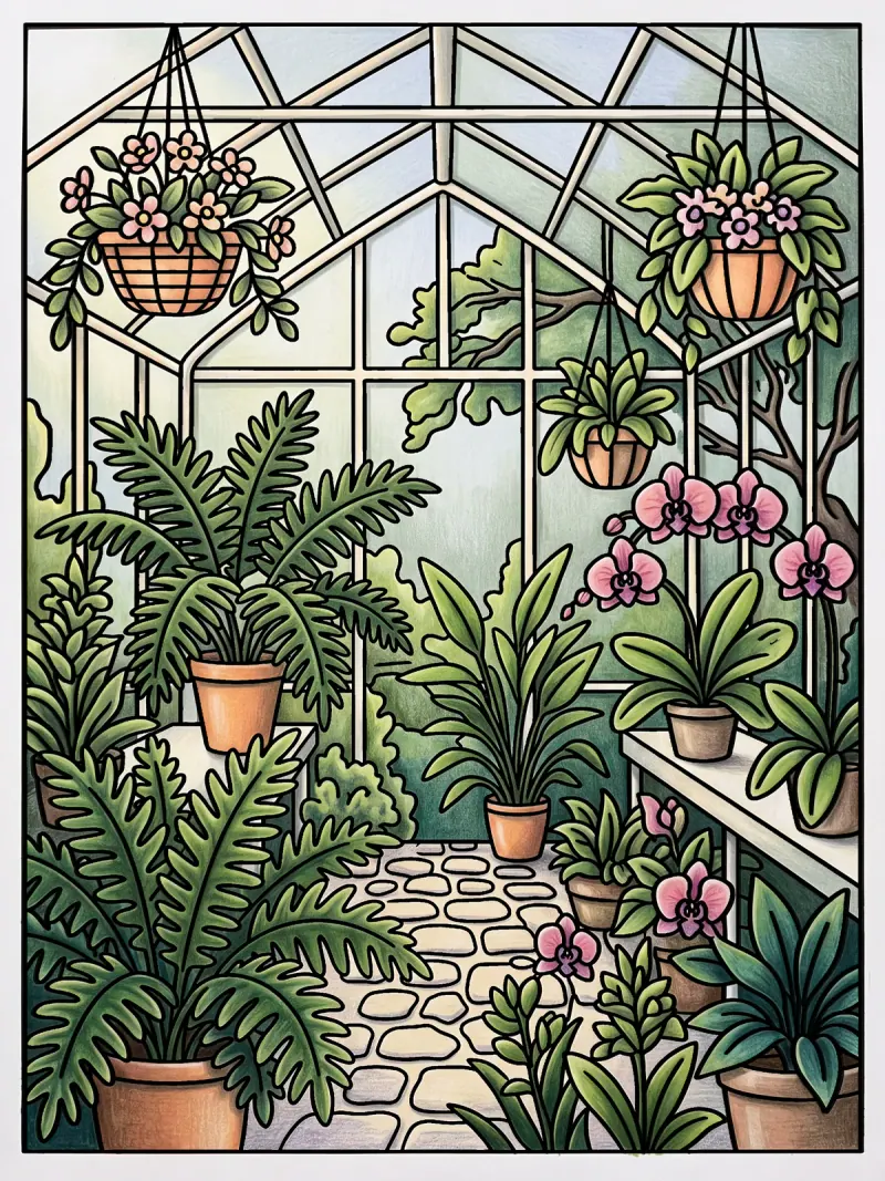
One coloring page, three color plans
A color plan is four choices made before you start: where the light comes from, five to seven colors, where the darks go, and one loud color. One lighthouse page, planned three ways.
You know the moment. Two-thirds of the way down a page, with the light going outside, you notice the sea and the sky are the same blue and the whole page has gone flat.
Every PencilDrop page arrives with the drawing done. The pages that look finished were mostly colored in someone's head first, and colorists call that a plan. A sticky note on the iPad case makes a good home for one, until it falls off.
You don't need one to start, since a tap on each shape makes a finished first page. A plan is for when you want the page to feel like somewhere. We planned the lighthouse on the headland three ways, and each coloring was made to a written plan whose opening line is quoted with it.
What goes in a color plan?
Four questions, in this order, because each answer narrows the next.
- Where is the light coming from? A time of day and a direction. It decides which side of every shape is lit.
- Which colors? Five to seven, from the page's suggested palette where it has them. Two that sit together and one from across the color wheel, plus a neutral or two.
- Where do the lightest lights and darkest darks go? Wherever you want the eye to land first.
- Which color gets to be loud? One, used small.
Seven sounds stingy if you own a tin of seventy-two. Try it anyway, and win back the half hour you'd have spent choosing between two near-identical greens.
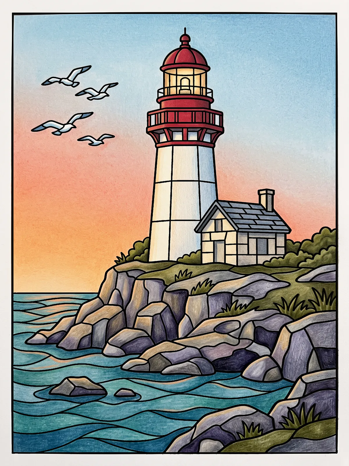
Golden hour, colored-pencil style
Late afternoon, the sun low on the left.
The palette leans warm, apricot and coral against teal and harbor blue, with driftwood gray and dune, a sandy cream, in between. The sky runs from apricot at the horizon to pale blue overhead, as it does at that hour if you step outside and look.
The rocks are colored grays, warm ochre-gray on the faces the sun catches and violet-blue gray in shadow, with the darkest darks pushed into the cracks of the foreground rocks. With real pencils, try a light violet under a warm gray.
The loud color is the poppy red of the dome, small and high on the page, and it's where your eye goes first.
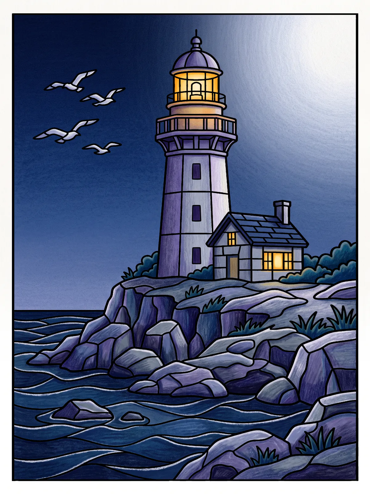
Moonlight, with the lantern lit
Night under a bright moon that is off the page to the upper right.
Switch the sun off and the plan turns over. Nearly everything goes midnight and dusk blue, with twilight violet in the tower's shadow, and the only warmth is the amber of the lantern and the cottage windows. A dark page with one small warm light is about as dependable as a plan gets.
The moon isn't drawn, yet the tower is lit on its right and every rock has starlight along its upper right edge, so you could point to it anyway. Save the lantern glass for last. After half an hour of deep blues, that stroke of amber feels like someone switching on a lamp.
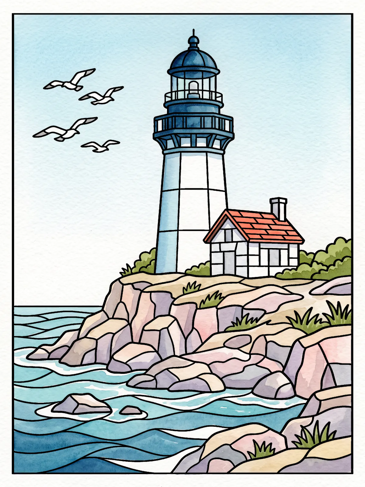
A summer morning, watercolor style
A fresh, clear summer morning, the sun high on the right.
In watercolor the highlights are the white of the paper, so the plan leaves plenty of it: a sky barely washed with sea foam and shallows, bare paper for the foam, a white tower with cool blue shadows, and a whitewashed cottage.
The dome, poppy red at golden hour, turns deep sea blue. That leaves the cottage's coral roof as the loud color, and on a page this pale, one small warm roof is plenty.
How to write your own color plan
Four lines on the back of an envelope will do: a time of day and a direction, five colors, the spot where the eye should land, and the one color you're saving for it. Then color.
When you've finished, prop the envelope against the screen and count how many of your four lines survived. Two out of four is a good evening.
These are our own examples of what a page can become, each colored to a written color plan. They aren’t competition entries.