Colour theory for colourists: five ideas for every page
Pick five colours, plan where the lights and darks go, warm the front and cool the back, keep one colour loud and mix your own greys. That’s most of the colour theory a page needs.
Colour theory tends to arrive as a school subject, all wheels and words like tertiary. Most of it can stay in the textbook. Five ideas from all that theory are worth bringing to every page you colour, once the dishes are done and the evening is yours, and if you keep only one, make it the first.
1. Use five colours on a page
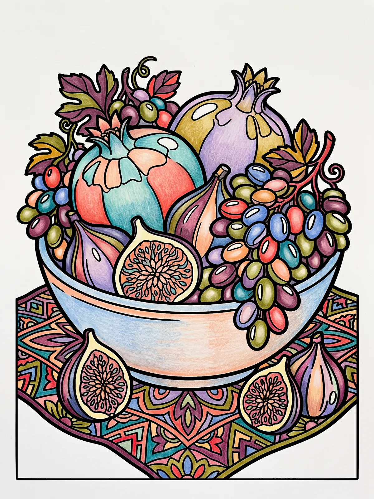
The most common difference between a page that looks like a picture and one that looks like a paint chart is how many colours are on it. A box of forty-eight pencils is a lovely thing to own. You don't need all forty-eight on one bowl of fruit.
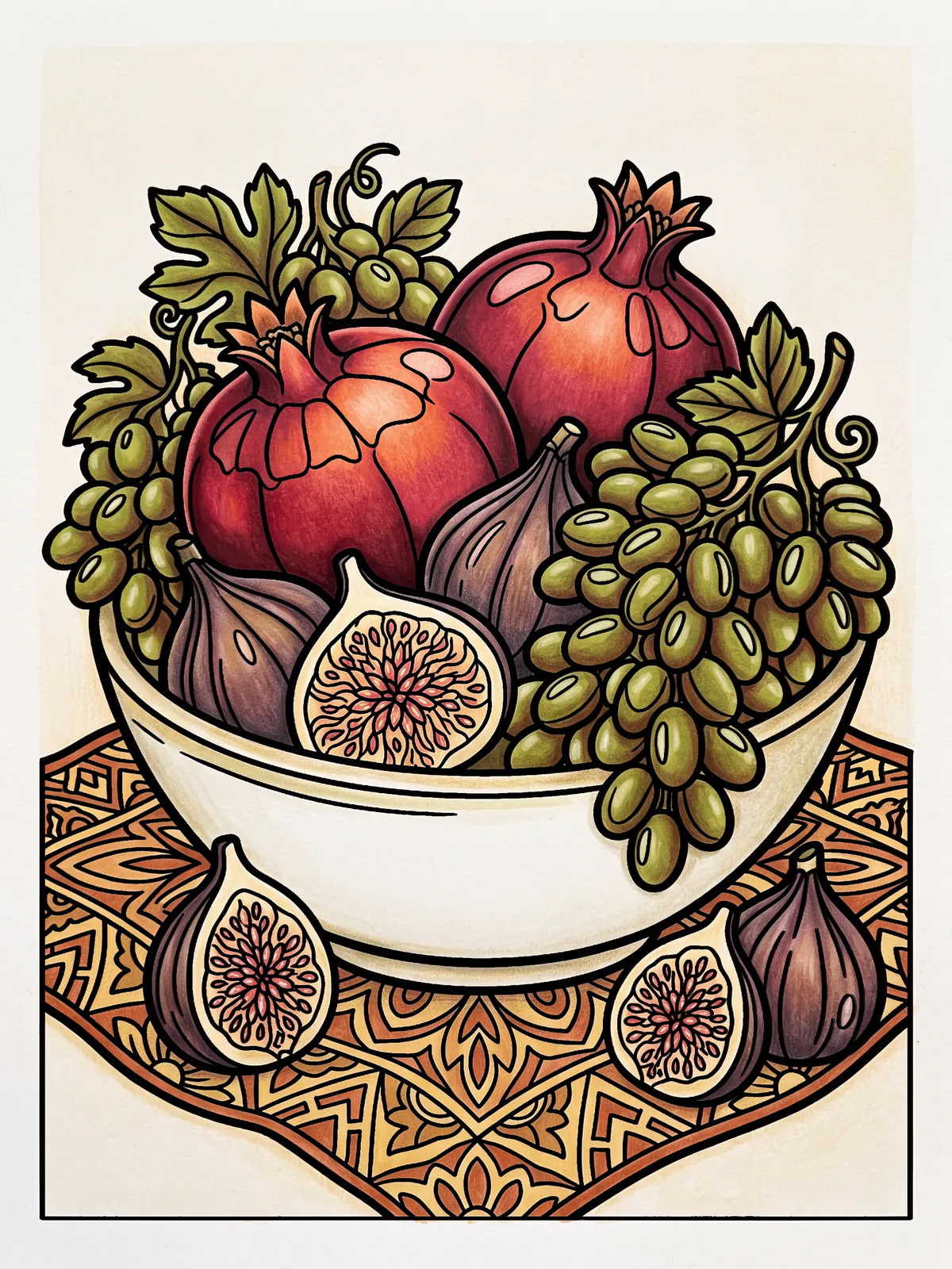
Next time, choose five before you start. Two that sit near each other on the wheel, say a warm red and an orange. One from across the wheel, a blue-green. Then two quiet near-neutrals, a warm grey and a cream. Colour the whole page with those, and when you want a colour you haven't got, layer two of the five to make it. The warm red laid lightly over the blue-green gives a dusky purple-brown, the colour of a ripe fig. The page will hang together, and you'll notice it the moment you zoom out.
Those five are the page's own suggested set. Every page in PencilDrop comes with colours drawn from its subject, and we've made named palettes for other moods. Start from the suggested set and swap one colour, two at most.
This works just as well with tap to fill, on a page you want done in ten minutes. Five colours, one tap per shape, and it already looks planned.
2. Plan where the light and dark go
Squint at a finished page until the colours blur. What's left is a pattern of light and dark, which painters call value, and your eye reads it before it notices a single hue. Lovely colours with no plan for light and dark tend to look flat, and most colourists have a few of those pages tucked away.
So decide early where the light is coming from, before the first stroke if you can. Keep the lightest lights and the darkest darks for the thing you want people to look at, and let everything else sit in the middle.
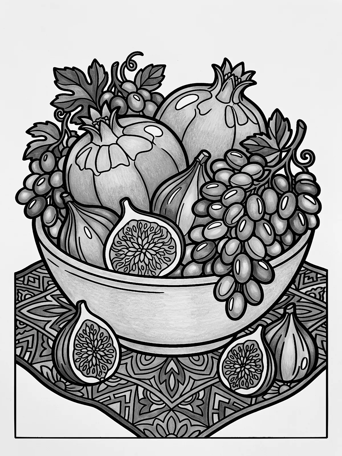
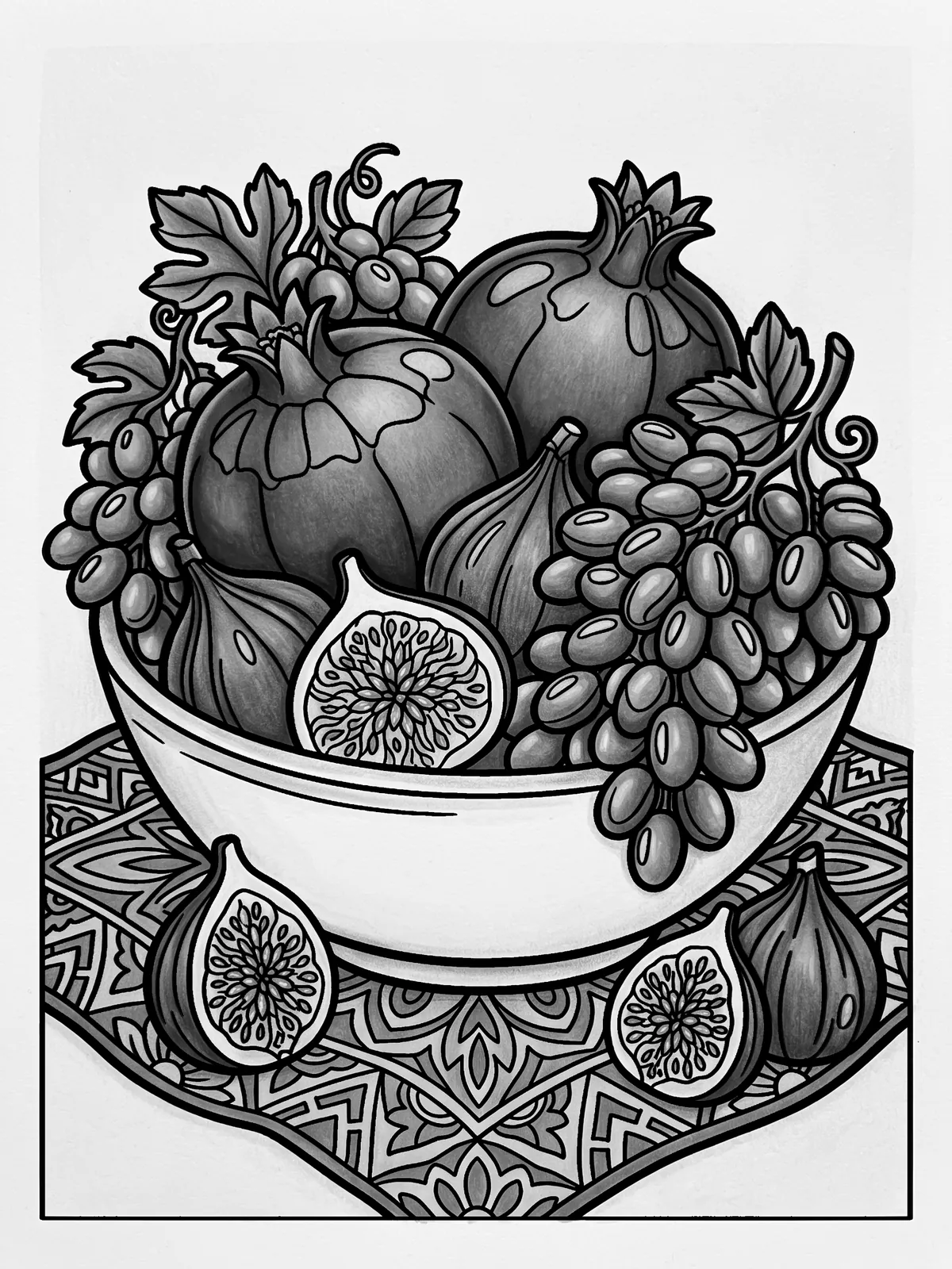
Take the colour away and the difference is obvious. The every-colour page goes to one even grey. The five-colour page keeps its dark pomegranates and figs against a pale bowl, and that pattern is most of why it reads as fruit in a bowl. To check your own page, take a screenshot and drag the saturation all the way down in Photos.
3. Warm colours come forward, cool colours sit back
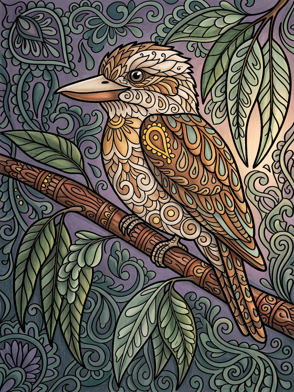
A cadmium orange looks nearer than a cobalt blue on the same sheet of paper, and that's enough to build depth into a flat drawing: warm the foreground, cool the background. It works on a mandala too. Colour the outer rings in cool blue-violets and the centre in hot rose and cadmium yellow, and the middle seems to rise towards you.
4. Keep one colour loud, and keep it small
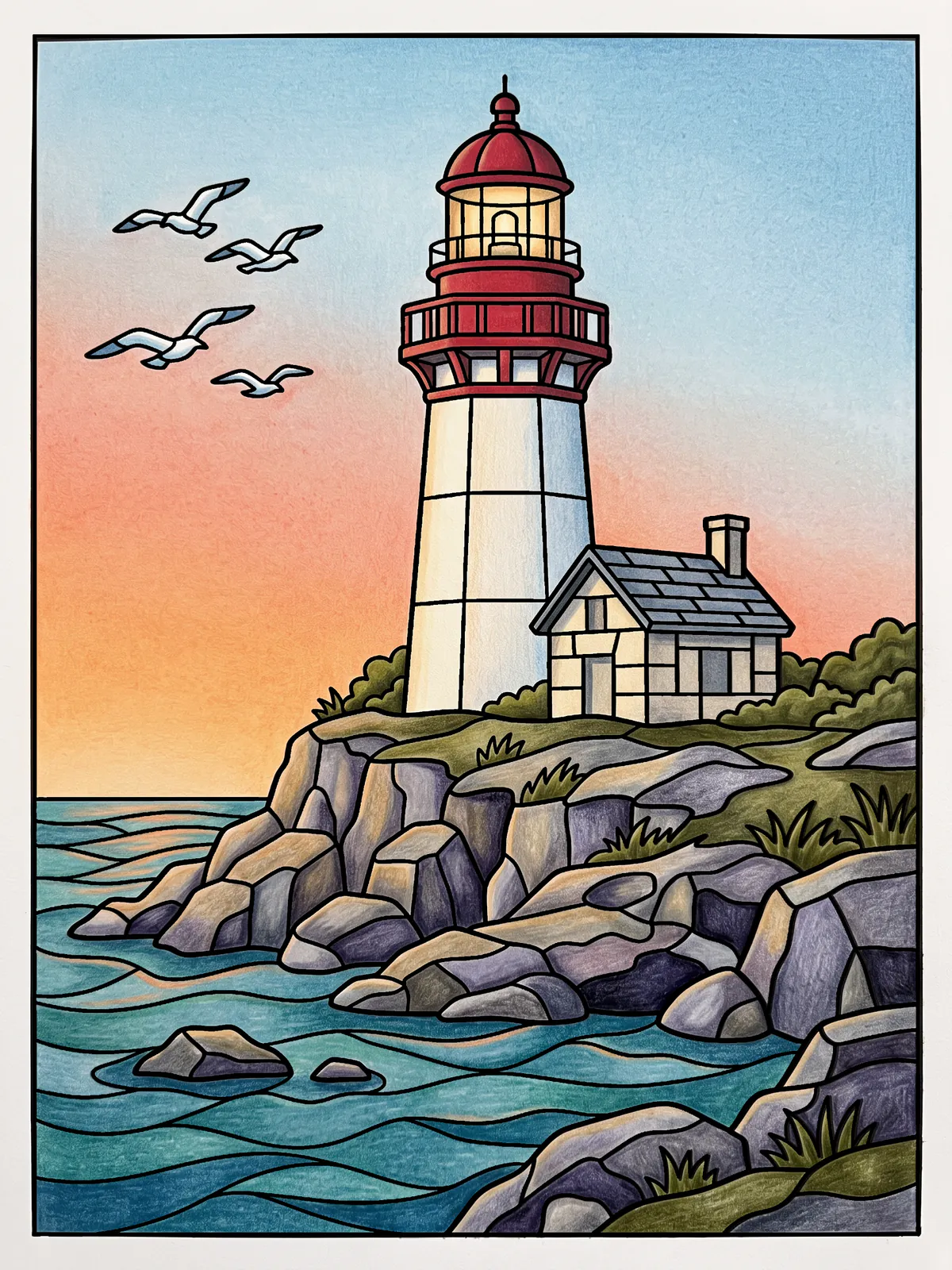
When every shape is bright, nothing stands out. Pick one colour to be the brightest, most saturated thing on the page and give it a small area. On the lighthouse below it's the red dome, a patch you could hide under a thumbnail, and it's where your eye goes first.
Put that colour down last, once you know where you want people to look.
5. Mix your own greys and browns
People new to colouring tend to skip grey and brown. Working artists use them constantly, because a coloured grey makes the bright colours next to it look brighter. You make one by layering two opposites lightly, a blue over an orange, or ultramarine over burnt sienna if you think in paint. Press harder with the blue and it cools, harder with the orange and it warms. Either way it has more life in it than a grey pencil from the box.
When a page starts to feel garish, try a quieter colour beside the loudest one before you change anything else.
Trying it on today's page
Everyone gets the same page each day, so it's a good place to try one idea at a time, and when you judge, you see what other people did with the same shapes. Start with the first. Before you touch tonight's page, choose your five, and when you want a sixth, layer two of them. Tomorrow, decide where the light comes from before you pick a colour.
The other forty-three pencils can stay in the box. They'll cope.
These are our own examples of what a page can become, each coloured to a written colour plan. They aren’t competition entries.