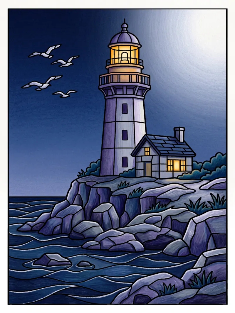
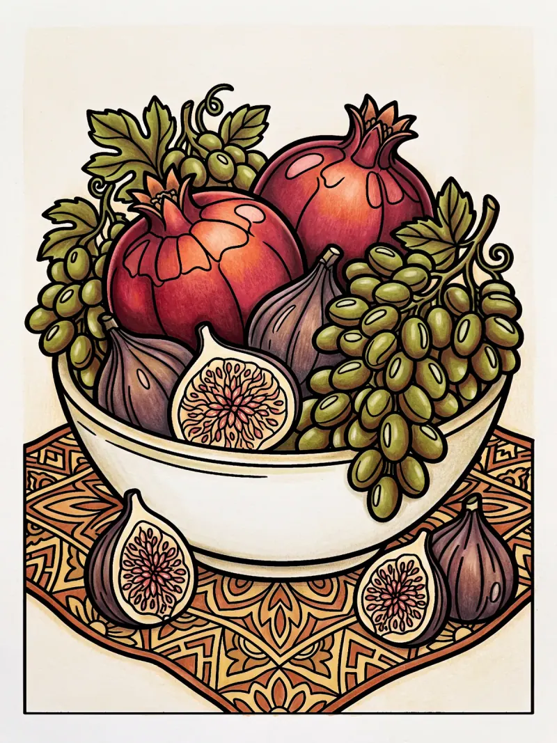
Cosy autumn colouring palettes: rust, olive, espresso and plum
Cosy colouring has gone seasonal: rust, mustard, olive, espresso brown and plum on a cream page. Here is where the palette comes from and how to try it on a PencilDrop page this week.
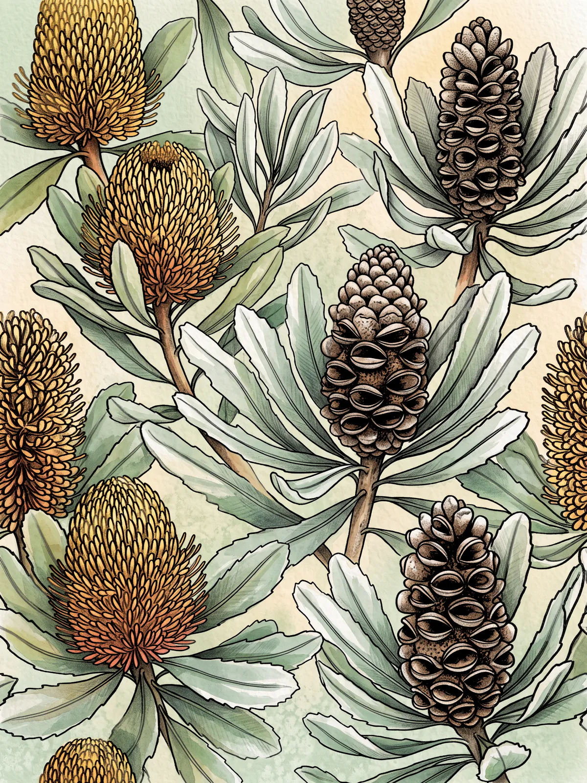
Cosy autumn palettes are the warm, earthy set of rust, mustard, olive, espresso brown and plum that colouring publishers, craft writers and even furniture makers are all reaching for this autumn, and they suit the point in the year when the evenings close in and a page and a pencil start to feel like the best plan for the night.
What is the cosy autumn palette?
It is a short list of warm, slightly muted colours with one dark anchor. Three sources from this October name close cousins of the same colours, from three different directions.
Colouring-book publisher Coco Wyo's fall palette guide (6 October 2026) sets out three named palettes. Its Pumpkin Spice set is mandarin orange, cinnamon brown and cream, with golden yellow and terracotta in support, and it suggests that for café scenes, baked goods and cosy corners. Its Golden Fall Nature set swaps in olive green and warm brown for leaves, trees and parks.
Mono-Moment makes a similar case in its guide to fall colouring books (12 October 2026). It recommends five pens: rust for leaves and pumpkins, mustard for light and warmth, forest green, brown for wood and baskets, and plum for shadows and berries. Its line about the mood is hard to better: "A candle, a blanket, a page and a pen is about as hygge as a hobby gets."
The third source isn't about colouring at all. Furniture maker Kelebek's 2026 autumn palette (9 October 2026) lists burnt orange and terracotta, espresso brown, olive and dark greens, beige and cream, and navy. That a sofa maker and a colouring publisher land on the same warm earth tones is a fair sign that the palette is in the air, not one company's idea.
Why now?
Two things meet. The first is the season: these are the colours of leaves, wood, spice and lamplight, and they come out every autumn. The second is the mood of colouring itself. Writing in The Conversation (9 February 2026), lecturer Christine Lining Bulandus noted that two of Australia's ten bestselling books of 2025 were Coco Wyo's cosy colouring books, and that the trend is popular on BookTok, where people share finished pages and colouring as a weekend ritual. She describes the recent books as simpler than the intricate bestsellers of 2015, built around comfort and rest.
Cosy pages and cosy colours go together. A warm, narrow palette asks very little of you: there are only a handful of decisions to make, and almost nothing clashes.
The palette, in named colours
Six colours will do. Each is named by at least one of the sources, and rust, olive and cream turn up in more than one.
- Rust, for the main warm shapes: leaves, pumpkins, a jug, a roof.
- Mustard, for light and for anything glowing, like a lamp or a window.
- Olive, for foliage and stems, a duller green that sits comfortably beside the rust.
- Espresso, your dark anchor, for wood, shadows and the deepest corners.
- Plum, for berries, fruit and the shadow side of warm shapes.
- Cream, for the paper, the highlights and the quiet areas.
Keep rust or mustard as the loud colour, used small, and let olive and cream take up the room. If you want to know why that works, colour theory for colourists goes through it.
How to try it on a PencilDrop page
The pomegranates and figs page is already half an autumn palette, and its own five-colour set (pomegranate, terracotta, green grape, honey and porcelain) shows how little you need.
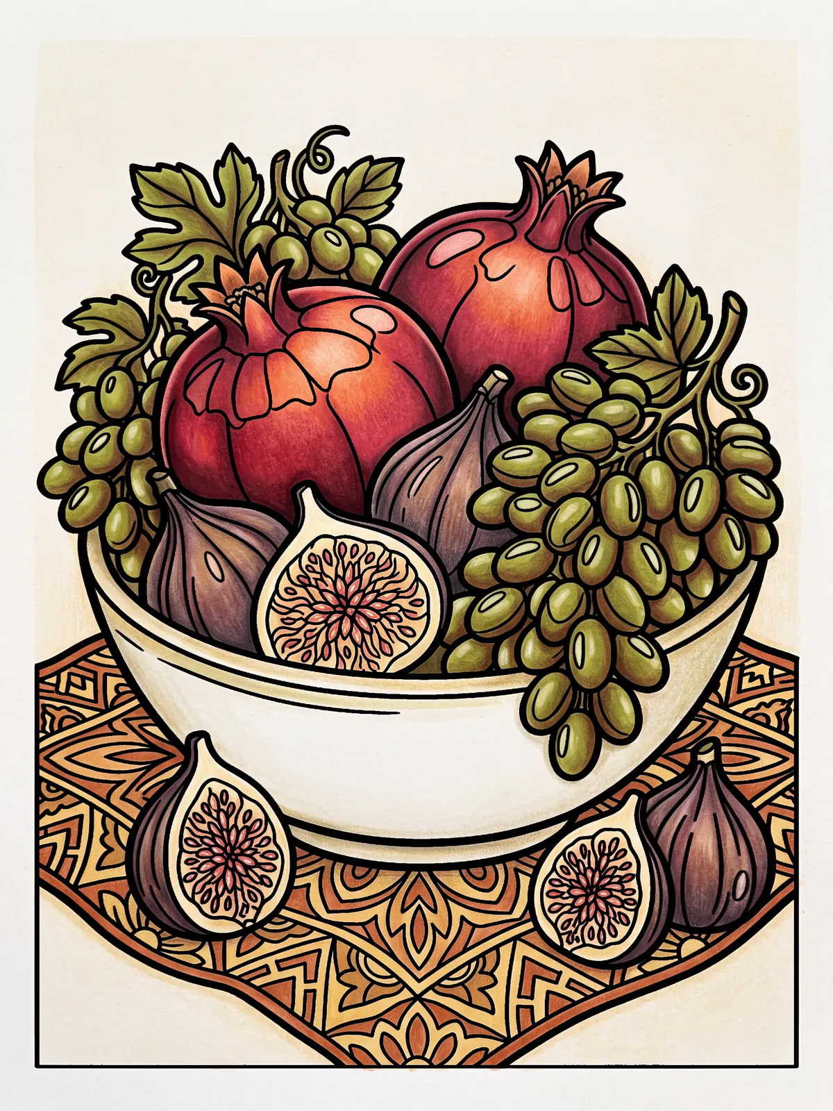
Here is one way to do it in an evening:
- Choose the light first. Imagine a single lamp on one side of the page, and put mustard where it lands.
- Fill the big shapes in cream, olive and rust. On a still life, the cloth is cream, the leaves olive and the fruit rust.
- Shade with plum and espresso. Lay plum along the side away from the lamp, and keep espresso for the narrow gaps between shapes. A light layer of plum over rust gives a rich, dusky red.
- Stop early. Warm palettes get muddy if you keep adding. When the page looks done, it is.
If you are short of time, tap to fill each shape with one of the six and call it a finished page. The palette does most of the work.
The free colouring pages are a good place to try this on paper, and today's page in the app is the same for everyone, so you can see what other colourists did with the same shapes. If competitions are what you are after, colouring competitions for grown-ups explains how ours work.
A note on the pages
The sources above are about palettes, and nothing here uses their pictures. PencilDrop's line art is made with AI image generation, then checked by software and approved by a person before anyone colours it; how a PencilDrop colouring page is made sets it out plainly. The colouring is yours.
Sources
- Coco Wyo, fall palette guide, 6 October 2026.
- Kelebek, 2026 autumn palette for furniture, 9 October 2026.
- Mono-Moment, guide to fall colouring books for adults, 12 October 2026.
- The Conversation, Adult colouring books are bestsellers again, 9 February 2026.
These are our own examples of what a page can become, each coloured to a written colour plan. They aren’t competition entries.
Quick answers
What colours are cosy autumn colouring palettes made of?
Warm, slightly muted earth tones: rust or burnt orange, mustard, olive green, espresso brown and plum, with cream as the lightest colour. Coco Wyo, Mono-Moment and the furniture maker Kelebek each name warm earth tones that overlap with this set for autumn 2026.
How many colours should I use for a cosy palette?
Five or six is plenty. Choose one loud colour such as rust or mustard and use it small, let olive and cream cover the large areas, and keep espresso for the darkest gaps.
Can I try the autumn palette without the app?
Yes. The free colouring pages on PencilDrop can be printed and coloured with pencils, and the same six colours work on paper or on an iPad.