Green is the colour of 2027: four green palettes to colour this week
Dulux, Benjamin Moore, Sherwin-Williams and Behr have all named a green for 2027. Here is why, and four named green palettes, from soft sage to deep forest, to try on a PencilDrop page.
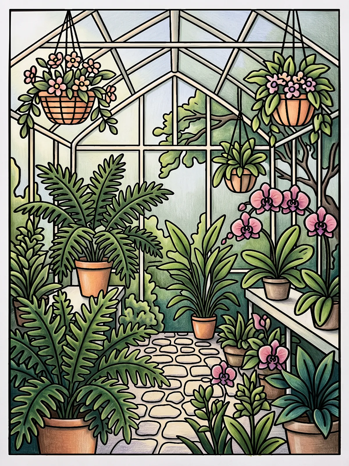
Green is the paint industry's colour for 2027: several of the biggest brands have named a green as their Colour of the Year since September, and the shades range from a soft sage to a deep, classic green. For colourists the timing is handy, because green is the colour that most rewards a bit of planning, and winter is a good moment to colour a greenhouse.
What happened
Four announcements, in the order they arrived:
- Dulux named Soulful Sage its Colour of the Year 2027, reported by KBB Review on 8 September 2026. Dulux calls it "soft and radiant", a gentle green that can sit with other greens in a two-tone scheme.
- Sherwin-Williams chose Celery (SW 6421), reported by Domino on 15 September 2026. The paint maker describes a yellow-leaning green that balances the crispness of leaves with the energy of sunshine, and suggests pairing it with creamy neutrals and natural materials such as linen, oak and aged brass.
- Benjamin Moore picked Webster Green HC-130, covered by Wallpaper on 14 October 2026. It sits between bright emerald and deep evergreen, and the article calls it "nature's neutral".
- Behr went for Grounded, an organic green between olive and moss, according to Midwest Design's running roundup, dated 28 October 2026.
It isn't unanimous. The same roundup lists Glidden, Valspar and Clark+Kensington choosing blues and Dutch Boy an earthy orange. So green is the strongest pattern among the 2027 picks rather than the only one. It also shows up in the fashion forecasts: Inside Out Style's October 2026 look at the forecasts notes that WGSN and Coloro include Meadowland Green in their spring/summer 2027 key colours and Deep Green in autumn/winter 2027/28.
Why green, and why now
The brands' own explanations lean the same way: calm, balance and a bit of the outdoors indoors. Sherwin-Williams talks about freshness and belonging, and Benjamin Moore describes its green as pairing stability with "optimistic energy". We would add a colourist's reason. Green is the colour nature uses most, so the eye is unusually good at spotting a bad one. A page of flat, identical greens reads as dead at once; a page of greens that lean warm in the light and cool in the shade reads as alive. Planning your greens is the quickest way to make a page look more professional.
Four green palettes to try
Each is a named set of colours. Start from the suggested set on your page, swap in the nearest of these, and layer two colours when you need one you haven't got. Keep to the five-colour discipline from colour theory for colourists: pick the palette, then add no more than one extra.
1. Soft sage (the Dulux direction). Sage mist, pale celadon, eucalyptus grey, porcelain, and a dusty rose as the one warm note. Light, quiet and restful. It suits a page with plenty of open space, where the sky or a wall can take the pale sage.
2. Fresh celery (the Sherwin-Williams direction). Celery, butter yellow, khaki, linen cream and warm oak brown. These greens lean yellow, so lay them over a warm cream and keep your shadows a cooler olive. Add a touch of aged-brass ochre for the small bright accent.
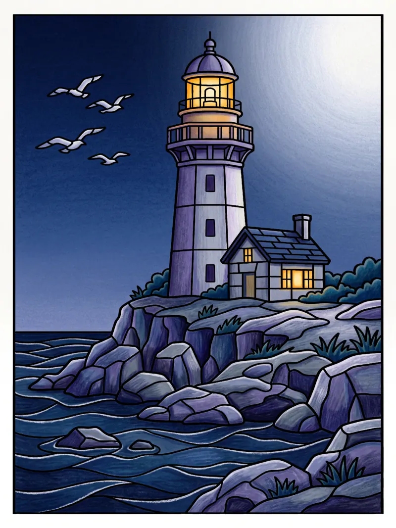
3. Deep forest (the Benjamin Moore direction). Webster-style forest green, deep teal-green, antique copper, bone and a soft black-green for the darkest darks. Heavy and classic. Keep the lightest lights for the one place you want people to look, because a dark palette needs a clear light to read well.
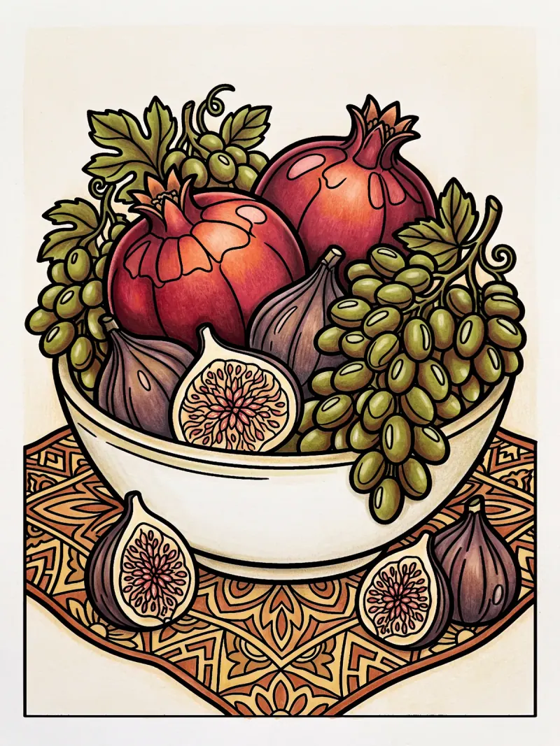
4. Moss and earth (the Behr direction). Moss, olive, wheat grass, terracotta and walnut. A grounded, garden-shed palette that makes a strong wildlife or still-life page.
How to colour green so it looks alive
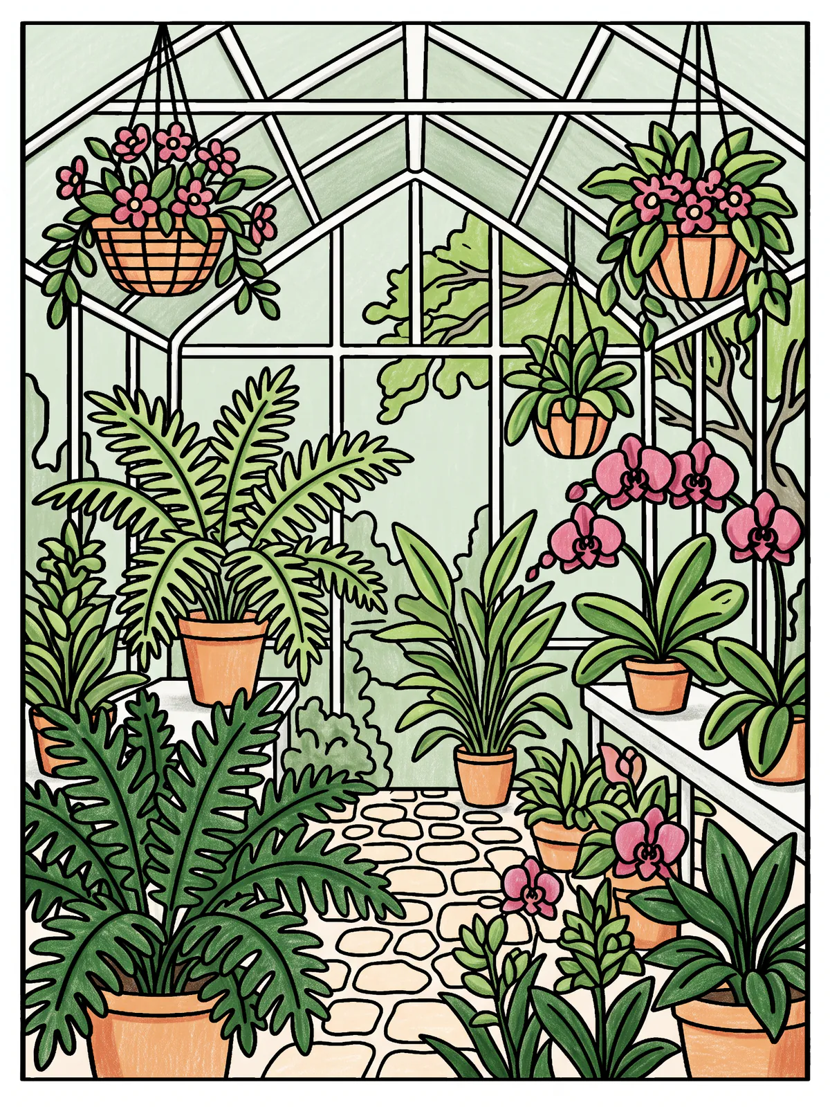
Two habits do most of the work, and both are on show in the greenhouse at the top of this post.
Give every leaf a lit side and a shaded side. Decide where the light comes from, then colour the lit edge of each leaf in a lighter, yellower green and the shaded edge in a deeper, bluer one. The morning greenhouse uses fern green, leaf green with new-growth highlights, and deep teal-green in the shadowed corners.
Put a different colour next to your greens. Green looks richest beside its opposite. A few rose orchids, apricot pots or a patch of terracotta make the greens look greener, and they give the page its one loud colour. If your greens start to look muddy, mix a leaf's shadow by laying a little rose-brown over the green rather than reaching for black.
Try it this week
The quickest way in is a plant page. Browse the free flower pages or the wider free colouring pages, choose one with plenty of leaves, and plan it like this: pick one of the four palettes above, decide where the light comes from, and save one non-green colour for the loud spot. Print it for a weekend with real pencils, or colour it on a tablet and compare palettes without ruining a page.
If you'd like to see what other colourists do with the same shapes, PencilDrop's daily page is the same for everyone, and you can enter your colouring in a free colouring competition.
A note on how our pages are made: the line art is drawn with AI image generation, then checked by software and approved by a person before anyone colours it, as we explain in how a PencilDrop colouring page is made. The colours are yours.
Sources
- KBB Review, Dulux unveils Colour of the Year for 2027, 8 September 2026.
- Domino, Sherwin-Williams names Celery its 2027 colour, 15 September 2026.
- Wallpaper, Benjamin Moore's 2027 Colour of the Year, 14 October 2026.
- Midwest Design, The 2027 colour-of-the-year announcements, thus far, 28 October 2026.
- Inside Out Style, Colour trends 2027: what the forecasts really mean for you, October 2026.
These are our own examples of what a page can become, each coloured to a written colour plan. They aren’t competition entries.
Quick answers
What is the colour of the year for 2027?
There is no single one. Dulux chose Soulful Sage, Benjamin Moore Webster Green, Sherwin-Williams Celery and Behr Grounded, all greens, while other paint brands chose blues, a dusty pink or an earthy orange.
What colours go with green in a colouring page?
Warm opposites make green look richer: rose, blush and terracotta. For a calmer page, pair green with cream, linen or oak brown.
How do I stop green looking flat when I colour?
Give every leaf a lit side in a lighter, yellower green and a shaded side in a deeper, bluer one, and vary the greens from plant to plant.